Senior design leadership in fintech and banking, building strong design teams and shipping products that hold up at scale, across markets, regulators, and the realities customers live in.
"The users your product ignores are usually the ones you should design for first, because that’s where the real design problems, and the real business opportunities, live." Humberto Torres
Impact at a Glance
Digital Net Promoter Score (NPS)
Scotia Caribbean mobile app up from 18.5 to 43
Conversion Improvement
Digital Sales Caribbean from 17% to 40% in Year 1
Teams Led
Cross-functional design teams across 6 countries & 2 languages
Awards Won
Digital Banking and IPTV
Years of Experience
Product Design & Direction
"Design is not a set-in-stone career, it is constantly evolving, and we must challenge ourselves and our teams to become more efficient and strategic."
I'm a Design Director and Product Design Leader based in Toronto, Canada, with 20+ years of experience creating digital products that bridge business strategy and human needs. My work spans fintech, retail, and enterprise, from Scotiabank's international banking platforms to consumer apps like Checkout 51.
To stay ahead of design trends, I blend curated digital exploration, active community participation, and continuous skill-building. I review award-winning work from agencies like Pentagram, ROSSUL, and Frog Design, and draw visual inspiration from Behance, Mobbin, and Awwwards.
Currently, I'm experimenting with AI and conversation-driven UI to pave the path for a “zero UI” mobile banking experience, designed to drive higher engagement, increase digital ROI, and accelerate prototyping. I pair this with a strong focus on research, data analysis, and renewed exploration of immersive AR/VR.
What I’ve learned across two decades in design is that the users your product ignores are usually the ones you should target the most. Building a banking experience for the Caribbean meant designing for customers who’d never had a reliable or trustworthy digital relationship with their bank, and on top of that, navigating a deep fraud culture. That constraint made the product stronger for every customer segment, not just the underserved ones. That’s what I ask of my teams: not just to design for the average user, but to find the extremes, because that’s where the real design problems, and the real business opportunities, live.
These principles travel. They were built across my career as IC and people manager, and they have shaped every product I have shipped. They help teams build for what comes after launch, not just for launch itself, and they keep the work coherent as it scales. At Scotiabank, they operate at the largest scale of my career: 4 markets, 12 countries, 4.24M banking customers.
If your product works for the most overlooked user, it works better for everyone.
Decisions made for users with the least access, to technology, literacy, or trust, produce solutions that are clearer and more resilient for all. Accessibility and inclusion are the sharpest design constraints you can impose on yourself.
Design and priorities flow regionally. Feedback and benefit realization happen locally.
A shared regional design system reduces redundancy and accelerates time to market, but only when it leaves room for local execution. The goal is not uniformity. It is a robust foundation with intentional space for regulatory, cultural, and behavioural context.
The roadmap should be informed by what customers do, not only by what they say.
Usage metrics, pain points across geographies, and behavioural analytics are design inputs from day one, not post-launch tasks. Every decision made without a feedback loop is a hypothesis. Every decision made with one is a tested position.
Every component, pattern, and decision should answer: where else could this be reused?
Scalability is not a technical concern appended after design is done. It is a constraint applied from the first wireframe. A solution that cannot flex across contexts, languages, and regulatory environments was not designed completely.
Cross-functional velocity is only possible when teams share knowledge as aggressively as they share deadlines.
Regional collaboration, sharing research and decisions across country teams, is the fastest accelerant available to a multi-market organization. Break the communication silos that slow delivery while preserving the enterprise standards that keep the product safe.
How fast your product responds is as much a design choice as how it looks.
The Doherty Threshold, 400ms, is the point at which users feel in control of the system. In markets where digital trust is low, response time is not a backend metric. It is a trust signal. Design must specify performance expectations, not inherit whatever engineering ships.
Led the end-to-end redesign of Scotiabank's first regional mobile banking app, starting with 2.4M customers in Mexico. Drove a unified, segmented, accessible experience across four markets while advancing design maturity and breaking silos. Digital NPS 67.9 → 73.2 · Mexico ranking #6 → #3 · Attrition −30% · $5M USD Y1 impact.
Transformed digital banking from a 1.6-star app to a benchmark for inclusive, scalable, and native mobile experience serving 12 countries, 2 languages, and 1.84M customers. iOS rating +2.3pts · Digital NPS 18.5 → 43.
Redesigned the grocery savings app experience for 12+ million members to increase engagement and retention. Achieving 4× faster offer listing, and 100k+ weekly searches with new redesign.

Every major tool shift in design history arrived with the same fear: that the tool would replace the designer.

Led the design of Scotia’s first fully online customer and product onboarding platform. Built to drive revenue, increase adoption, reduce costs, and lower regulatory risk across the Caribbean region.
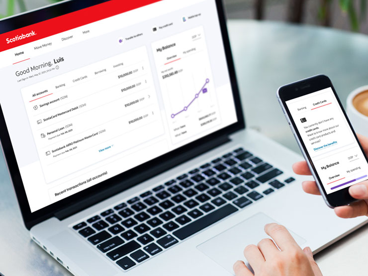
Built Scotia’s new regional online banking platform from the ground up. WCAG-compliant from day one, deployed across all 12 markets on a single micro-app and service architecture. Cut operational and maintenance costs at the regional level.
A speculative futures project envisioning the grocery shopping experience of tomorrow. AR glasses with wayfinding overlays, personalized shelf-talkers, AI-powered nutritional tracking, and immersive VR prize integrations.
Designed the next-generation OTT TV personalized content experience, an app that learns from user preferences through agile, continuously tested iterations.
Nominated for Best Branded Content App at the 2016 Appy Awards. Led art direction and UX for this IPTV fitness app, engineering 850+ algorithmically generated workout videos across difficulties, durations, and target areas.
Redesigned this seasonal app launched to 8M+ subscribers across AT&T U-verse, Bell Fibe TV, CenturyLink, and Telus Optik, featuring VOD, games, karaoke, and real-time Santa tracking.
Complete redesign of a children's reading TV app, envisioning an immersive world where Tumblebooks characters live and interact, with a focus on intuitive navigation and self-discovery for young users.
A selection of motion graphics, broadcast design, and branded video work spanning TV commercials, interactive installations, IPTV experiences, and digital advertising. Here are some of the brands I have had the pleasure of collaborating with: AT&T, Scotiabank, BELL, Rogers, Pelmorex, Century Link, Facebook, News America Marketing, CEMEX, Banamex, Ticketmaster, Chevrolet, Telcel, Coca-Cola, among others.
Designed and produced 14 in-between branded video segments stitched into seamless IPTV workout experiences, intro, exercise intervals, postroll, pre-roll, and app trailers. Available on AT&T U-verse and BELL FibeTV. Software: After Effects & Photoshop.
Full TV ID package for Fox Production Films, aired on TSN2. Used Snow Crown logo geometry and colour palette to drive animations capturing the speed and dynamism of the sport. Elements: intro, lower 3rds, transitions, standings panel, credits. Software: Maya, After Effects, Photoshop & Illustrator.
Reel covering video walls, interactive games, touch-screen experiences, video editing, TV commercials, and digital advertising, produced for 14 major brands including Telcel, Chevrolet, Coca-Cola, and Ticketmaster.
Tell me what you're building, I usually reply within a day. Saludos.
Toronto, Ontario, Canada
Send Message